View our locations
  Make a payment
  Apply for financing

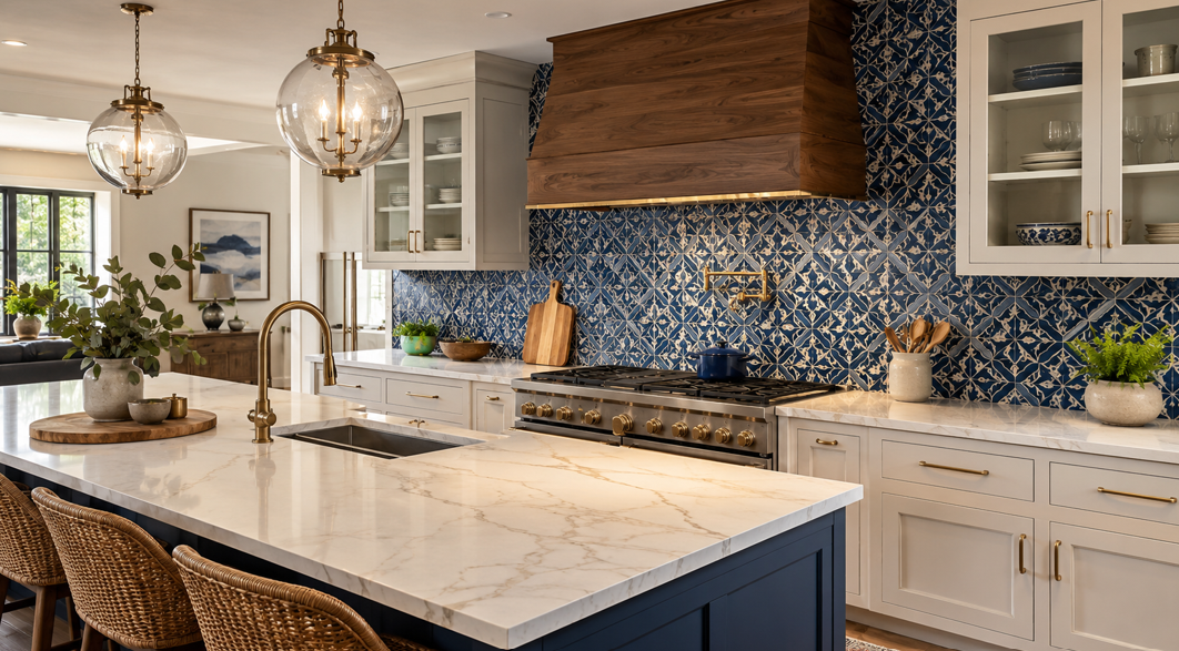
Make the Backsplash the Star Without Losing Balance
A bold tile backsplash can completely change the mood of a Richmond kitchen. Deep green subway tile can make the room feel rich and grounded. Patterned encaustic-style tile can add personality. Glossy blue tile can brighten a darker space, while dramatic black tile can create a sleek, modern focal point.
The challenge is choosing a countertop that supports the backsplash rather than competing with it. When both surfaces demand equal attention, the kitchen can feel visually crowded. When the countertop is too plain for the rest of the design, the backsplash may look disconnected. The best pairings create contrast, repeat a small detail, or provide a calm foundation that lets the tile stand out.
Homeowners planning a coordinated kitchen can turn to Richmond Decorating for local guidance on flooring, cabinets, countertops, tile, and other interior finishes. The company has served Central Virginia since 1977, giving Richmond-area families access to multiple design elements under one roof.
In most kitchens with a bold backsplash, the safest countertop choices have controlled movement, a limited color palette, and an undertone that connects naturally with the tile. White quartz, softly veined stone, warm beige surfaces, charcoal countertops, and restrained concrete looks can all work beautifully. The right option depends on the backsplash color, pattern scale, cabinet finish, lighting, and the atmosphere you want to create.
Start With the Visual Role of Each Surface
Before comparing materials, decide which surface will lead the design. In a kitchen with bold tile, the backsplash usually becomes the focal point. That does not mean the countertop needs to disappear, but it does mean its pattern and color need to play a supporting role.
Let One Pattern Lead
Patterned tile already creates movement. Geometric shapes, floral motifs, contrasting grout, and multicolored designs naturally draw the eye. Pairing those features with a heavily veined countertop can introduce too many competing lines.
A calmer countertop lets the backsplash pattern read clearly. Look for minimal veining, fine speckling, soft tonal variation, or one quiet color that relates to the tile. The goal is to create visual breathing room, not a boring surface.
Use Contrast With Intention
Contrast can make a kitchen feel energetic and polished. A dark green backsplash against a pale countertop creates a clean division between the two surfaces. A white backsplash with bold black grout can look sharper above a charcoal or soapstone-inspired countertop.
Contrast works best when another element repeats the relationship. Dark cabinet hardware, black window frames, warm wood shelves, or metallic lighting can help the pairing feel connected rather than accidental.
Repeat One Small Detail
Another approach is to pull a quieter color from the backsplash into the countertop. A patterned tile may contain cream, taupe, gray, blue, or rust alongside its dominant color. Repeating one of those secondary tones can make the design feel cohesive without creating an exact match.
Avoid trying to match every shade. Materials installed on different planes and under different lighting rarely appear identical. A related undertone usually creates a more natural result than a forced color match.
White and Softly Veined Countertops for Colorful Tile
White and off-white countertops are popular partners for bold tile because they create a clean visual foundation. They reflect light, keep the room from feeling heavy, and work with a wide range of cabinet finishes.
Crisp White With Saturated Color
A bright white countertop can sharpen the look of emerald, navy, cobalt, burgundy, or black tile. The combination feels especially effective in kitchens with limited natural light because the pale surface helps bounce light across the room.
Warm White With Earthy Backsplashes
Creamy white and ivory surfaces pair naturally with terracotta, olive, ochre, clay, and handmade-look tiles. Their warmer undertones prevent the kitchen from feeling too stark.
Soft Veining for a Touch of Movement
A white countertop with delicate gray, beige, or taupe veining can add refinement while keeping the backsplash in control. The best veining for a busy tile is usually thin, widely spaced, or low in contrast.
If the backsplash is a solid color with a simple layout, the countertop can carry slightly more movement. A dark blue subway tile, for example, may work well with a white surface featuring graceful gray veins. A multicolored geometric tile usually benefits from a quieter countertop.
When White Is Not the Best Choice
White can make every color around it appear stronger. That is useful when the backsplash needs emphasis, but it may feel too sharp in a kitchen designed around soft, muted tones.
It can also highlight undertone differences. A cool white countertop beside creamy tile may make the tile look yellow. View full-size samples together before making a final decision.
Warm Beige, Taupe, and Greige for Patterned Tile
Warm neutral countertops offer a softer alternative to white. Beige, taupe, and greige can support patterned tile while giving the kitchen a comfortable, inviting atmosphere.
Beige for Warm, Layered Kitchens
Beige countertops work well with backsplashes that include warm white, brown, amber, terracotta, olive, or muted red. They can also complement natural wood cabinetry by repeating its warmth.
Rather than choosing a flat beige, look for subtle texture or fine movement. A lightly mottled surface can feel natural and forgiving without competing with the backsplash.
Taupe for Sophisticated Contrast
Taupe sits between gray and brown, which makes it highly adaptable. It can connect cool tile with warm cabinetry or soften a kitchen that includes black accents.
A taupe countertop can look especially polished with deep green, muted blue, charcoal, or patterned black-and-white tile. It adds depth without the dramatic weight of a very dark surface.
Greige for Mixed Undertones
Greige combines gray and beige, making it useful when a backsplash includes both warm and cool colors. It can also bridge the gap between white cabinets and warmer flooring.
This is often a practical choice in open-plan homes where the kitchen needs to relate to several adjoining finishes. The countertop can act as a transition between colorful backsplash tile, wood flooring, and neutral living-room furnishings.
Keep the Pattern Scale Controlled
Warm neutral countertops may include veining or cloud-like movement. When the backsplash is highly patterned, choose a surface with a fine or low-contrast pattern. When the tile is bold mainly because of color, the countertop can include more visible texture.
Homeowners comparing coordinated cabinets and countertops can evaluate finishes together rather than selecting each surface in isolation. This makes it easier to see how undertones, patterns, and sheen levels interact.
Dark Countertops for Dramatic Backsplashes
Dark countertops can create a sophisticated, grounded look when paired with bold tile. Black, charcoal, deep brown, and soapstone-inspired surfaces add visual weight and can make saturated backsplash colors feel even richer.
Black With High-Contrast Tile
A black countertop works beautifully with white tile, especially when the backsplash includes black grout, graphic patterns, or dark accents. The repeated color creates a strong design connection.
It can also pair with jewel-toned tile for a dramatic, moody kitchen. Emerald green, sapphire blue, and deep burgundy all gain intensity beside a dark work surface.
Charcoal as a Softer Alternative
Charcoal provides depth without the full impact of black. It can be easier to integrate with stainless steel appliances, gray flooring, and mixed metal finishes.
A charcoal countertop often works well with handmade-look tile because both surfaces have visual softness. Choose a matte or low-sheen finish when you want an understated, contemporary result.
Consider the Room’s Light
Dark countertops absorb more light than pale surfaces. In a kitchen with small windows or dark cabinetry, balance them with pale upper cabinets, under-cabinet lighting, light walls, reflective tile, or a lighter floor.
Watch for Visible Debris
Dark surfaces can conceal some stains, but they may show crumbs, dust, fingerprints, or hard-water marks more clearly. Finish and pattern influence how noticeable these marks become. A gently mottled charcoal surface may be more forgiving than a flat, polished black.
Match Countertops to Different Bold Backsplash Styles
The type of boldness matters. Some backsplashes stand out because of color, while others rely on pattern, texture, layout, or grout.
Saturated Solid-Color Tile
For solid-color tile in green, blue, red, or black, countertops can range from simple white to softly veined stone looks. Because the backsplash pattern is restrained, the countertop has room for a little movement.
Match the undertone rather than the exact color. A cool navy tile may suit white or gray veining, while a warmer teal may look better with cream or taupe.
Geometric and Multicolored Tile
Geometric tile already creates direction and rhythm. Choose a countertop with minimal movement and pull one quiet tone from the design.
A solid white, soft gray, warm beige, or charcoal surface can keep the pattern readable. Avoid adding another bold pattern directly beneath it.
Handmade and Textured Tile
Textured tile changes with the light and may include natural variation. Pair it with a countertop that has a controlled pattern and a complementary finish.
A pale quartz look, honed dark surface, or warm neutral countertop can all work. The ideal choice depends on whether the tile feels rustic, refined, glossy, or organic.
Bold Grout Lines
Sometimes the tile itself is simple, but contrasting grout makes the backsplash dramatic. White tile with black grout is the clearest example.
Repeating the grout color in the countertop, hardware, or light fixtures creates a strong visual connection. A black countertop can make the design graphic, while white or pale gray keeps it lighter.
Large-Format Slab Backsplashes
A slab backsplash with dramatic veining acts like artwork. Pairing it with a countertop from the same or a closely related material can create a seamless look.
If the slab pattern is especially strong, keep cabinetry and hardware restrained. The continuous surface already provides plenty of movement.
Cabinet Color Can Change the Entire Pairing
Countertops and backsplashes never exist in isolation. Cabinet color surrounds both surfaces and strongly affects how they are perceived.
White Cabinets
Use undertones carefully. Bright white cabinets may clash with creamy counters, while warm white cabinetry often pairs more naturally with beige, taupe, and earthy tile.
Wood Cabinets
Wood introduces warmth and visible grain. With bold tile, a quieter countertop helps avoid too much movement.
Light oak works well with white, greige, soft gray, and warm concrete looks. Dark walnut can support pale countertops or create a moody effect with charcoal surfaces.
Painted Green or Blue Cabinets
Colorful cabinets plus bold tile require careful balance. One surface may need to become more restrained.
A simple white, cream, taupe, or low-movement gray countertop can separate the two colors and give the eye a place to rest. Repeating a cabinet tone subtly in the backsplash can create cohesion.
Black or Charcoal Cabinets
Dark cabinets can look striking with bold tile, especially when paired with a lighter countertop. White, cream, and pale greige surfaces create separation and keep the work area visible.
A dark countertop can also work, but lighting becomes especially important. Use reflective tile, warm lighting, and lighter surrounding finishes to maintain balance.
Small Design Details That Pull the Look Together
Once the main surfaces are selected, smaller decisions determine whether the kitchen feels polished.
Grout Color
Matching grout allows tile shapes to blend into a more unified surface. Contrasting grout emphasizes layout and makes each tile more visible.
When the backsplash is already colorful or patterned, quieter grout may reduce visual noise. Simple tile can handle a stronger grout contrast.
Countertop Edge Profile
A simple eased or square-style edge often suits a bold backsplash because it does not add another decorative element.
Hardware and Fixtures
Hardware can repeat a countertop or grout color. Black hardware may connect a white countertop to black grout. Brass can warm blue or green tile. Nickel and chrome can reinforce a cool, clean palette.
Avoid adding too many unrelated metal finishes. A coordinated mix feels intentional, while several competing finishes may distract from the backsplash.
Lighting
Under-cabinet lighting can reveal undertones, highlight tile texture, and make dark surfaces easier to use.
View samples under warm and cool bulbs before finalizing the design. A countertop that looks neutral in daylight may appear warmer or cooler under artificial light.
Flooring
Flooring covers a larger visual area than the backsplash, so its color and pattern need to support the kitchen palette.
If the backsplash and countertop already contain strong movement, a quieter floor can create balance. When the backsplash is bold but the countertop is simple, natural wood grain or subtle stone-look flooring may add welcome texture.
Test the Full Combination Before You Commit
Samples are one of the most useful tools in kitchen planning. A countertop may look perfect online and completely different beside the actual tile and cabinet finish.
Gather samples of the backsplash, countertop, cabinet color, flooring, paint, and hardware. Place them together in the kitchen and view them throughout the day.
Pay attention to:
Warm and cool undertones
Pattern scale
Surface sheen
Natural daylight
Evening lighting
Reflections from nearby colors
How the materials look from adjoining rooms
Whenever possible, view a larger countertop sample. Small pieces may not show the full pattern, veining, or color variation.
It also helps to photograph the combination in the room. A photo can make competing patterns or mismatched undertones easier to notice.
Most importantly, choose a pairing that suits the way your household lives. A beautiful kitchen needs to support cooking, cleaning, gathering, and everyday routines. Discuss care requirements, surface performance, and installation needs alongside color and pattern.
A bold backsplash can give a Richmond kitchen memorable personality, while the right countertop brings balance and lasting appeal. When the surfaces share an undertone, respect each other’s pattern scale, and connect with the cabinets and lighting, the entire room feels thoughtfully designed.
Ready to compare countertop, cabinet, and tile combinations for your kitchen? Get in touch for personalized guidance and help planning a cohesive Richmond-area remodel.